Redesigning the TechCrunch app

Over the last two years we have been working hard to improve the experience of TechCrunch products for our readers. Our tiny-but-mighty product team launched the brand new TechCrunch mobile app for Android and iOS earlier this month and we couldn’t be more excited. It has been completely redesigned with the goal of giving you easy access to the news you care about most, no matter where you are.
TechCrunch has had an app in the market for a long time, but it hadn’t been well-maintained and became outdated, even as mobile consumption of news grew over the years. Our mobile app users are among our most dedicated readers, and reimagining the app to better serve them represented a unique design opportunity.
We realized usage of our mobile apps was dropping for a few reasons: the apps weren’t fully native, ads were obtrusive, there was lack of support for certain operating systems and the user interface was outdated. My team and I were excited to come up with something unique and innovative that also could elevate the TC brand. After sharing rough sketches and wireframes internally we realized we needed to start simple, focusing on this question: What are we offering that’s uniquely native?
To get a better idea of where we were standing, we surveyed current users and looked closely at app store reviews. These findings led us to define the first concepts with these high-level goals in mind:
- Personalized news: Almost half of our surveyed users confirmed they wanted personalized news. While some care about VR, others might just want to get news about biotech and diversity. We needed to cater different worlds (with different content) for all TC users.
- Notify users with fresh content: Send push notifications with content tailored to user interests.
- Provide Crunchbase data: Discovering which companies are trending, got funded or acquired is something our audience finds very valuable.
- Offline reading: Allow users to save directly from the push notification on the lock screen and sync across devices. This is part of a “know now, deep-dive later” idea.
These goals gave us a clear direction for an MVP that has three top-level screens:
TechCrunch News Feed: To access all featured and latest stories, essentially your home feed of stories.
Your News: To access a feed of personalized stories, notifications and manage topic subscriptions (I’ll talk more about this in a bit).
Saved Feed: To access bookmarked stories offline.
Once the requirements for each feature were defined, we created two prototypes that were tested with users allowing us to discover some interesting insights. We iterated based on those.
Making TechCrunch yours
Your News is a space for accessing all the stories you care about; catch up on missed notifications and subscribe or unsubscribe to topics.
On the top bar, you’ll find three tabs: For You, Notifications and Topics.
The For You feed presents all articles from topics to which you’ve subscribed. While the For You feed maintains the home feed article card components, it’s more visual, and articles are organized here by category.
The Notifications screen is where all your notifications will live. Articles here are organized in the order the notification is received; tapping on the notification takes you directly to the article.
And finally, the Topics screen is where you can easily subscribe/unsubscribe to TechCrunch’s topics at any time. Subscribing to different topics will change the stories you get notified about and which stories appear in the For You feed.
One of the aspects that stands out visually on Your News screens is the use of emojis. We learned from user testing sessions that users were more drawn to the prototype that had emojis incorporated in the interface. They said the emojis “felt familiar” to them. With that in mind, we decided to give this area of the app a friendlier experience while making stories more recognizable throughout the flow: from getting a push notification on the lock screen to quickly scanning categorized For You stories.
Creating a frictionless onboarding process
Our initial assumption was that creating a fun and interactive way for users to subscribe to topics would get them to complete the process without much friction. We tried a card-swiping interaction that was novel for some users, but ultimately felt forced. We learned there is more willingness to complete the process when presenting all topics on one view without requiring swiping or scrolling. It was simple and more efficient.
Getting Crunchbase information
Besides having the ability to bookmark and share an article, you also can get Crunchbase information about the company or person the article is about. The benefit behind this feature is to get more context on the subject mentioned in the story.
Adding texture to a uniform news feed
Observing how people read news on mobile devices got us thinking carefully about how they scan through content and how we can optimize the card layout to make scanning easier for our readers. The first iterations were focused on clarity and emphasis using a lot of white space. The initial designs used a large card treatment for all articles, with minor differences on the card components depending on the article type.
Ultimately, this design didn’t test well as it felt too uniform andneeded to be “texturized.” We then opted for a solution that displays card variations with different components to help create a better sense of hierarchy, a more condensed and less monotonous news feed that displays more news with less scrolling and, consequently, a more efficient and better experience.
Handling the influx of notifications
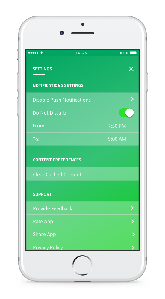
One of the great advantages of enabling push notifications in the app is that you can get news curated by TC editors every day. For each topic you subscribe to, our editors will pick the 1-2 most important stories to send you as push notifications. To solve for the concern of getting too many pushes per day — encouraging users to disable them — we have set five pushes as a hard limit, even if you subscribe to all 12 topics. Additionally, we designed a setting that gives users the ability to set a quiet time to not be disturbed for a period of time.
Our approach was to keep reading the news simple while adding non-traditional features such as personalized news feeds, topic subscriptions and push notifications. We’re excited about the next features we have in the pipeline. We hope you enjoy the new experience and tell us what you think, because, ultimately, this app is for you!
You can download the app for iOS and Android.
Big thanks to Robyn, Dwight, Jedd, Saurabh, Awais, Jose, Nicole and Mischa for the amazing effort.
Published at Sat, 21 Oct 2017 11:00:53 +0000


